Survey Best Practices

Martha Brooke, Interaction Metrics Chief CX Analyst, asks: "Ready to put your survey program to the test?"
Trusted by leading companies worldwide

Put Your Survey Program to the Test ➔

This tool assesses how well your surveys follow proven survey best practices, so you can build trust, increase response rates, and get actionable insights from the data you collect.

Each question targets a specific part of how surveys get built and read: question wording, respondent invitations, and open-ended feedback.

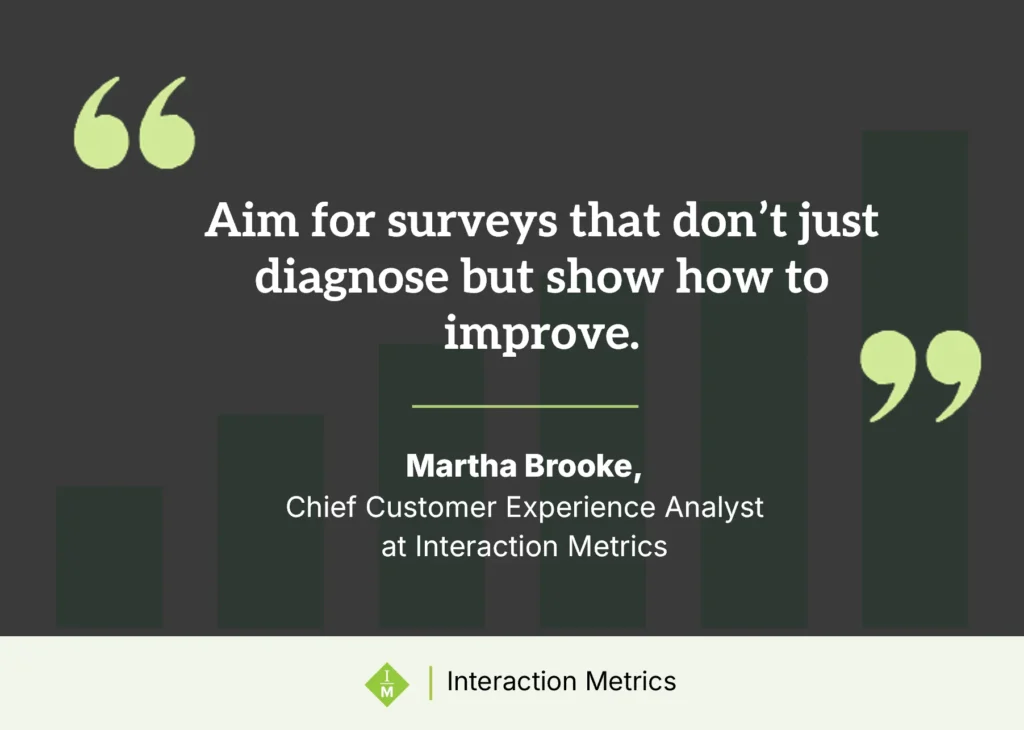
Interaction Metrics Chief Customer Experience Analyst Martha Brooke, with a quote on designing surveys that show how to improve, not only diagnose

What Your Score Means

Your score points to the strengths and gaps in how you run surveys. Whether you scored high or low in the quiz above, the answers below explain the reasoning behind each option: why the practice matters and where it fits in the survey process.

Most survey programs tell you what’s wrong and stop there. Interaction Metrics doesn’t. Chief Customer Experience Analyst Martha Brooke puts it simply: “Aim for surveys that don’t just diagnose but show how to improve.” Every project runs on that principle.

See the full answer breakdown ➔

Certified Customer Experience Professional
Customer Experience Professionals Association Founding Member
Best in Class CX Thought Leader
A+ Rated Chamber of Commerce
Interaction Metrics gets the 6 sigma black belt certification badge

"*" indicates required fields

Better Questions = Better Data

The core principles of how to write survey questions well: one idea per question, a specific reference point, nothing assumed.

“How satisfied were you with our engineer?” sounds fine, but it actually assumes the customer is at least somewhat satisfied.

An example showing how biased survey questions can skew results and falsely show satisfied customers
True Data™ surveys
True facts icon
True-Facts
True Data™ surveys
Bias-free design.
Higher data accuracy icon
Objectivity wins. +210% better data
True tech icon
True-Tech
All software included.
Lower total cost icon
Save money. 39% project savings
True Inisght icon
True-Insight
Correlations and more.
Improved Clarify icon
Align teams. 5x faster decisions
arrow from a great symbol connected to a checkmark to show the expertise needed for survey design

A good customer survey isn’t one click. It’s dozens of steps.
We handle them all.

Built-In Features that Drive Growth

Survey icon
AI icon
Insights icon
Gears icon
Graph icon
Next steps icon

Trusted by Companies Like Yours

5/5 – Outstanding
“Interaction Metrics provided insights into customer experience that we couldn’t achieve alone. Their Service Evaluations and Surveys have been eye-opening and transformative!”
Andrew Larsen Talent & Development Program Manager Acme Construction
5/5 – Amazing
“It was great to have Interaction Metrics do the kind of deep dive into our call center quality and analytics that is so desperately needed but that we just can’t make the time to do. A great service for a great value.”
Leah Wilson Executive Director The State Bar of California
5/5 – Impressed
“We continue to be impressed by the quality and clarity of Interaction Metrics’ Findings Reports and surveys. They have guided my team on how to stay on the cutting edge of the customer experience.”
Dennis Fitzgerald VP Customer Satisfaction Yaskawa America Inc.
Trusted by leading companies worldwide

The AI Survey Trap

Level 1

If you already have your survey designed, power it up with the best software and the experts who know how to use it.

$1500-$3000

Level 2

All your survey questions, logic flow, rating scales, email campaign, and every other step are managed for you.

$6000-$9900

Level 3

Crosstabs, correlations, text analysis, dashboards, and findings decks with next-step actions presented to your team.

Varies by Complexity

Tag icon

Need Something More Tailored?

Not every challenge fits neatly into a package. We build custom research and survey strategies for teams with unique goals, complex audiences, or multi-phase initiatives.

The Full Answer Breakdown

#1. How do you remove bias from your surveys?

Best Answer: An outside team systematically removes leading or loaded language.

An internal review reliably catches typos and rarely catches bias, and the reason has nothing to do with how sharp the reviewer is. The wording that nudges a respondent toward an answer is usually the wording that felt most natural to write, so the colleague reading the draft is reading it with the same assumptions that produced it. They approve the leading question for the same reason it got written. Systematic outside review works because the reviewer has no investment in the answer coming back a particular way.

How bias creeps into surveys →

#2. Does your survey allow for anonymity?

Best Answer: Yes

Without the option, you lose respondents in two directions at once. Some soften what they say, which inflates the scores. Others skip the survey, which distorts who’s in the sample. Anonymity doesn’t make anyone honest by itself, but withholding it costs you candor, and in B2B, where the person answering knows the account manager by name and expects to be on a call with them next quarter, the cost is considerable.

Learn how anonymity reduces drop-off and helps you avoid survey fatigue →

#3. How do you ensure representative response? (Check all that apply)

Best Answer: Boost outreach to underrepresented groups AND use sampling and weighting to accurately reflect our customer base.

Whoever happens to answer is not the same group as the one you needed to hear from. Left to itself, a survey collects responses from the people with the strongest feelings in either direction, and a program built on their answers gets designed for the extremes. Consumer research absorbs this through sheer volume. A B2B program running against forty accounts has no volume to absorb anything with, which is why representativeness has to be engineered before the survey goes out rather than assessed after it closes.

Read how to increase survey response rates →

#4. For your quantitative analysis, what do you use? (Select all that apply)

Best Answer: Generally, you want to use all of these:

  • Crosstabs to reveal patterns across segments (e.g., customer type, region)
  • Correlation analysis to identify meaningful relationships
  • Simple metrics like NPS or Effort Score for top-level reporting
  • Weighted scoring to reflect what matters most to customers
  • Benchmarking against past results or industry standards

Reporting a metric and analyzing data are different activities that tend to get filed under the same name. The score tells you where you landed. Crosstabs tell you who’s pulling it down, correlation tells you which parts of the experience are actually moving it, weighting keeps the dimensions customers care about from being averaged against the ones they don’t, and benchmarking tells you whether the number was any good to begin with. Run only one of these and most of the information stays on the table.

Blending qualitative + quantitative analysis →

#5. How do you analyze open-ended feedback?

Best Answer: Combine AI with critical thinking to capture context, emotion, and nuance.

Open-ended responses hold the reasons behind every score in the survey, which is why the method matters more here than anywhere else in the analysis. AI clusters quickly and reads shallowly. It will return the five most common themes ranked by frequency, as though frequency and importance were the same measurement. What it won’t do is read across the responses and notice that three accounts reached for the same odd phrase to describe a problem nobody has named yet. That reading is still human work.

See how to get real value from open-ended feedback →

#6. What describes your survey invite approach?

Best Answer: Invite encourages honest feedback. They include a reply-to address, giving customers a way to share input beyond the survey.

The invitation is the first thing you ask a customer to evaluate, whether you intended it that way or not. A message from no-reply@ tells them the exercise is a form to be completed rather than a conversation someone will read, and they answer it in that spirit. A live reply address costs nothing and changes what comes back. So does saying plainly that you want the criticism and not only the praise.

See how your email practices reflect your listening culture →

#7. How do you handle Findings Reports and presentations?

Best Answer: A dedicated team focuses on presenting insights clearly and visually.

The most common end state for a survey program is a dashboard everyone has access to and nobody opens. That’s a translation failure rather than a reporting one, because the data is present and correct and organized for the person who collected it instead of the person who has to do something about it. A findings report earns the name when the operations lead can read it and know what changes on Monday, which is a different document from the one the CEO needs to see.

See how to make your dashboard truly work →

#8. Finally, how would you describe your customer listening approach?

Best Answer: Ask timely, customized questions based on current challenges and customer moments.

Sending the same templated survey every quarter does produce a trend line, and a trend line is worth having. The problem is a program where the template is all there is, since it can only ask about what mattered on the day someone wrote it. Programs that work hold a core set of questions steady so the tracking survives, then rotate the rest to match what’s actually happening in the business. Strategic listening is that second part.

See how longitudinal tracking separates real change from short-term noise →

Survey Design Principles at a Glance

Survey Design Principles

Most survey advice explains how to write one. Very little of it explains how to read one, which is the harder problem and by some distance the more common one. Almost nobody is starting from a blank page. There’s a survey that’s been going out for three years, someone inherited it from someone who left, and the question isn’t how to write a survey. It’s whether to keep trusting this one.

Evaluation is also cheaper than rewriting, and it’s the only thing that tells you whether rewriting is necessary. What follows is what we look for, roughly in the order we look for it.

What Are Survey Design Principles?

Survey design principles are the methods used to decide what to measure, how to ask about it, and how to structure questions, scales, and flow so results are accurate and actionable.

They cover construct selection, question wording, scale format, answer options, question order, and routing logic. A survey with well-worded questions and a badly chosen scale still returns misleading data. So does a well-built survey with the questions in the wrong sequence. Design is the whole system rather than the phrasing alone, which is why evaluating one means going through it in order rather than reading it start to finish and reacting.

Many surveys are broken before anyone takes them. Not because of the platform or sample size, but because no one asked the right question at the start: what do we actually need to know, and what will we do with the answer?

That is why survey design principles matter. Good design does not just produce a score. It produces feedback that is more valid, more specific, and far more useful.

Decide What You’re Measuring: NPS, CSAT, or CES

The first thing to check is the thing most reviews never reach. Wording problems are visible and satisfying to fix, so a review that starts at question one and works forward will spend its energy on adjectives and never ask whether the survey is pointed at the right thing. A beautifully written question about the wrong construct is still the wrong question.

Satisfaction, effort, and loyalty aren’t variations on a theme. They respond to different organizational changes and they predict different behavior, which is why the three standard metrics can’t be swapped for one another the way they routinely are.

NPS asks whether a customer would recommend you. It’s a loyalty signal, and a broad one.

CSAT measures satisfaction with a specific interaction, which makes it sharper than NPS for transactional feedback and weaker for the health of a relationship.

CES measures how much friction someone had to push through to get something done, which suits support and service touchpoints rather than relationship surveys.

In B2B the choice gets harder, because no single number describes the relationship. An OEM, a distributor, and an end-user touch different parts of your organization and would answer the same question about genuinely different experiences. Averaging them produces a figure that describes none of them accurately. A weighted score, where the dimensions that drive retention carry more weight than the ones that don’t, gets closer to something you can act on. That’s the reasoning behind the QCI™ Score.

What Makes a Survey Question Biased?

Four patterns account for most survey bias, and all four are easier to see in someone else’s survey than your own.

Leading questions carry the answer inside the question. “How satisfied were you with our engineer?” reads as neutral and isn’t, since it takes for granted both that satisfaction is the right axis and that the respondent had some. “How would you rate our engineer’s expertise?” asks about one thing the respondent can assess from experience.

Double-barreled questions ask two things and collect one answer, which makes the answer uninterpretable. “How would you rate the speed and quality of our response?” returns a 3 from the customer who found it fast and sloppy, and a 3 from the customer who found it slow and excellent. You now have two 3s and no idea what to fix.

Vague constructs like “quality” or “overall experience” produce numbers nobody can act on, because nobody knows what the respondent was rating when they answered.

Unbounded timeframes like “recently” or “typically” let every respondent pick their own reference period. Some are describing last month and some are describing 2019, and the average of those two things isn’t a measurement of anything.

Underneath all four is a single rule: one idea per question, a specific reference point, nothing assumed.

Politeness Bias in B2B Relationships

Politeness bias shows up as inflated scores rather than as anything you could point at in the questionnaire, which is why it survives most reviews. In B2B it’s the largest single distortion in the average program and the least discussed. The respondent knows the account manager. They’ve worked with the rep for three years. A relationship they privately consider shaky gets rated “fine,” because saying otherwise on a form feels like an accusation against someone they like and expect to talk to again.

Question construction helps at the margins. Asking how clearly a project scope was communicated is harder to inflate than asking someone to rate the team, since it requires evaluating something specific instead of expressing general goodwill. Separating the person from the process reduces the instinct to protect a relationship. Fully labeled scales close off the vague middle that respondents drift toward when they’d rather not commit.

None of that solves it. A contact who has worked with the same account manager for five years will not describe a service failure honestly on a survey the account manager’s company sent, whatever the confidentiality notice promises, because the relationship is more present in the room than the notice is. Third-party administration is the only thing that reliably changes what comes back.

That is a self-serving thing for a third party to tell you, so treat it as a hypothesis rather than a finding. It’s cheap to test. Run the same survey both ways and compare the distributions.

How to Choose a Rating Scale

The 5 vs. 7 vs. 10-point debate gets more attention than it repays. Any of them works. What doesn’t work is changing your mind halfway through a program, since a 7.2 on a ten-point scale and a 4.1 on a five-point scale can describe identical sentiment and can’t be compared to each other. The trend line breaks at the switch and never really recovers. Scale consistency is a data integrity question rather than a preference.

Labels do more work than points. When only the endpoints are labeled, each respondent privately decides what the middle means, which means they’re answering slightly different questions while you average the results as though they weren’t. Labeling every point costs nothing and removes the ambiguity.

The midpoint deserves a decision rather than a default. Including one gives genuine ambivalence somewhere to go, which keeps it from contaminating your positive and negative counts. Removing it forces a direction out of people who don’t have one. Either choice is defensible. Arriving at it by accident isn’t.

How to Design Answer Choices

Options that overlap force an arbitrary pick, and the respondent’s arbitrary pick becomes your data. Options that don’t cover the realistic range do the same damage more quietly, since the respondent selects the nearest available answer and nothing in the output tells you they were reaching.

A missing “not applicable” is the most common version of this. Someone with no basis for an opinion will supply one anyway when the form demands it, and that answer is noise wearing the exact costume of signal.

The opposite failure is false precision. Most people can’t reliably separate “extremely satisfied” from “very satisfied,” so a scale treating them as distinct data points is manufacturing detail that doesn’t exist. False precision is worse than no precision, because it looks like a finding.

Survey Length, Question Order, and Response Quality

There’s no correct length, but the relationship is dependable: as a survey gets longer, response quality drops, and it drops faster when the questions feel irrelevant to whoever is answering.

The failure mode isn’t abandonment. Abandonment at least announces itself in your completion rate. The real cost is the respondent who stays and stops thinking, straight-lines the same answer down every row of the matrix, and hands you a completed response that’s worse than a blank one because you’ll count it. A tight ten-question survey usually outperforms a sprawling twenty-five-question one for exactly this reason.

Order matters on its own. Satisfaction ratings belong before demographics rather than after. Open-ended questions belong after the structured ones, where the respondent has just spent a few minutes reconstructing the experience and has something specific to say, rather than at the top, where they’ll write a sentence about nothing in particular and you’ll code it as though it meant something.

Skip Logic and Role-Based Routing in B2B Surveys

Sending every respondent through every question tells them the survey wasn’t built with them in mind, and they answer in that spirit. Skip logic handles the obvious cases.

In B2B it has to work at the role level, because an OEM, a distributor, and an end-user don’t touch the same parts of your organization. The OEM cares whether their people are getting adequate training and technical enablement. The distributor wants to know whether sales support is working in their channel. The end-user has opinions about field service responsiveness that neither of the others is in a position to offer. Route each of them to the touchpoints they actually have and the answers come back grounded in something real.

This is also where platform reporting runs out. A crosstab in Qualtrics or Alchemer will show you that distributors in the Southeast rate technical support lower than everyone else. What it won’t tell you is whether that’s a finding or an artifact of how the sample happened to land, and the difference between those two is the difference between spending money well and spending it on a coincidence.

Data Integrity: Cleaning the Data Before the Analysis

A survey program can have flawless routing and perfectly written questions, but the math is only as good as the final dataset. The conventional way is to accept whatever raw data the software platform exports. A science-first approach requires respondent-level data cleaning before the analysis even begins.

This means systematically auditing the responses to strip out duplicate entries, ineligible contacts, and low-quality data—like the respondents who straight-lined the same answer down every row just to finish. If you don’t clean the data at the respondent level, you aren’t analyzing customer sentiment; you’re just analyzing noise dressed up as data.

Survey Design for High-Value B2B Relationships

Off-the-shelf survey design was built for consumer scale, where small imperfections wash out across thousands of responses and the model tolerates a great deal of sloppiness. A B2B program running against forty accounts has no averaging to hide behind. Every non-response is a real gap. A handful of answers from the wrong contacts will move the overall score. What the platform reports as an insight might be six people.

Stakeholder complexity compounds it. The OEM, the distributor, and the end-user at a single account frequently disagree about how the relationship is going, and they can all be right, because they’re describing different parts of it.

Sometimes the honest conclusion is that a survey is the wrong instrument. When a relationship is sensitive, when the topic needs back-and-forth to get at, or when the population is too small for any quantitative finding to hold up, a structured interview will tell you more. Different tool, same standard: design for honest data rather than comfortable data.

The Bottom Line

Survey design determines the quality of your data before a single response arrives, which is why evaluation belongs in front of fieldwork rather than behind it. A survey built to a scientific standard produces findings a team can act on. A survey built from a template produces a score, and a score with nothing underneath it is just a number that shows up every quarter.

If the surveys you’re running aren’t producing the clarity you need, that’s usually a design problem. Design problems are diagnosable, which is the whole premise of the quiz at the top of this page.

Get in touch to talk through what you’re trying to measure, have us evaluate the survey you’re sending now, or build a new one from scratch.

Frequently Asked Questions

More Resources

22 Best Practices for Surveys: Tips for Writing, Design, and Analysis

You’ve probably been on the receiving end of a bad survey. Maybe it asked you to rate a delivery you never received. Or it forced you to choose between three irrelevant response options, none of which applied to you. Or perhaps you actually took the time to explain a problem in your own words, and […]

May 1, 2025

Analyzing Open Ended Survey Questions—Is AI Your Solution?

Analyzing open ended survey questions is the single most fruitful method for getting meaningful, honest feedback. Employees and customers can express themselves through text and say what’s really on their minds in a way that’s impossible through structured rating questions. Open-ends are your ‘gold’ but extracting the gold is challenging, which is why companies look […]

December 10, 2024

B2B Customers: The Guide to Building Better Surveys

How happy were your B2B customers this year? In 2023, what will you do differently? The reason I ask is that most B2B customers are having mediocre experiences: The software development company ClearlyRated finds that B2B sectors like manufacturing, engineering, and banking have NPS scores in the mid-40s. And the market research company B2B International […]

December 22, 2022

Customer Experience Science

In 1620, Francis Bacon broke with the conventions of his time by articulating a new approach to investigating nature. It’s what we now call the Scientific Method, a way of thinking which remains the gold standard for how we comprehend the world today. Instead of looking to fate or mysticism to explain nature, the Scientific […]

January 4, 2021