TrueData™ SURVEYS
CX Analytics that Cut Through the Noise
See what’s working—and what’s not—with analytics built for clarity, action, and customer-focused growth.
B2B Survey Experts + Third-Party Objectivity + Software Included
We bring certified analysts (CCXP) and proven methods. And, you’ll have no licensing costs, no learning curve.
Quantitative analysis works with the numbers: ratings, scores, how segments compare, what’s changed over time.
Qualitative analysis works with the language: what customers wrote, what themes emerge, and why the scores landed where they did.
One tells you what happened. The other tells you why. A survey program that runs only one track produces conclusions that are either shallow or anecdotal — you need both to get the full picture.
| Aspect | Quantitative | Qualitative |
| Structure | Structured formats (Likert scales, checkboxes) | Unstructured (free-text, interviews) |
| Examples | “Rate our support from 1–5” | “What could we have done better?” |
| Focus | What happened, how often | Why it happened, how customers feel |
| Data Type | Numbers, percentages | Words, stories, tone |
| Output | KPIs, benchmarks, correlations | Themes, sentiments, unexpected discoveries |
| Good For | Measuring trends, comparing over time | Discovering new issues, understanding root cause |
| Limitations | Can miss context, oversimplify feelings | Harder to scale, requires interpretation |
Let’s Build the Right Survey for You!
Stop settling for surveys that fall short. Let’s build a survey that gives you honest answers, drives action, and accelerates growth.


"*" indicates required fields
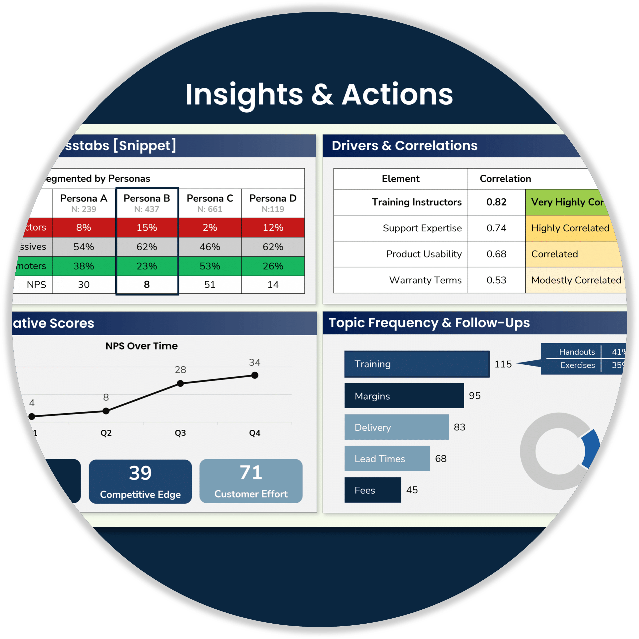
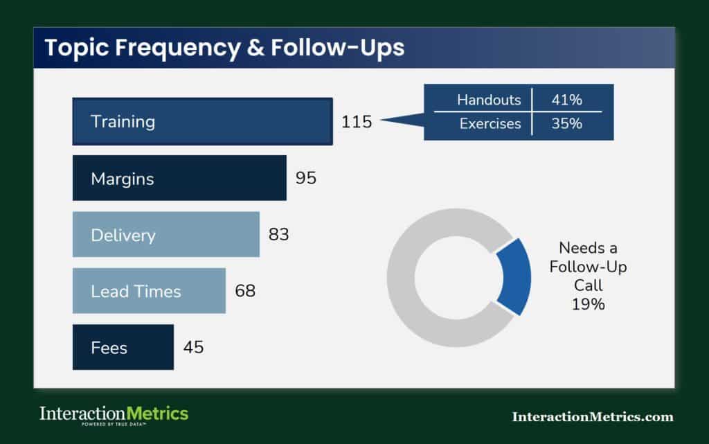
From Comments to Priorities
Thematic tagging gives you a ranked view of what customers are actually talking about and what matters most to them.
In this example, training surfaces as the most frequently mentioned topic, with specific subtopics (handouts, exercises) coded within it.
The donut chart flags the share of respondents whose comments indicate a need for a follow-up call — a finding that only emerges when responses are read and coded rather than counted.
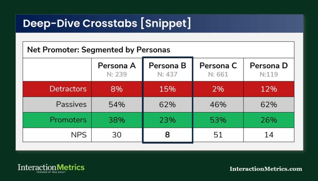
Crosstabs and Subgroup Analysis
Crosstabs break overall results into segments to surface patterns that aggregate scores conceal.
An overall satisfaction rating that looks stable can be hiding a serious problem in one account tier, one region, or one customer type — and without crosstabs, you’d never know it was there.
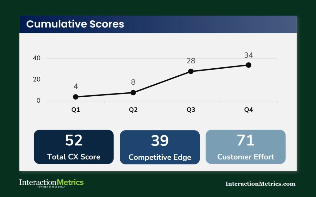
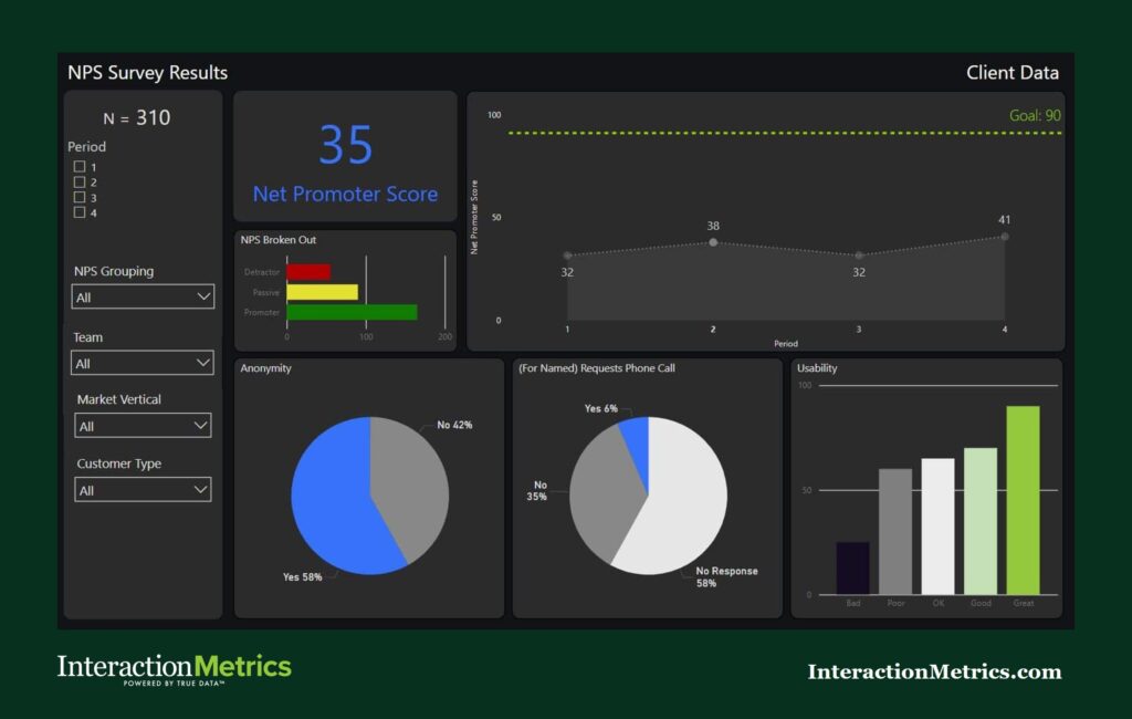
Track Your Satisfaction Metrics
A single score tells you where you stand. Scores tracked across quarters tell you whether you’re actually improving — and whether that improvement holds across different parts of the business. We track NPS, CX Score, Total CX Score, QCI™, and Customer Effort Score over time, so you can see trends rather than snapshots. In B2B, where account relationships develop slowly and problems compound quietly, the trend line is often more important than any individual result.
Filter, Slice, and Drill Down Your Data
Scores mean more when you can slice them. Our dashboards filter by period, team, market vertical, and customer type, so you can see not just what the overall NPS is, but whether it’s improving, where it’s lagging, and which segments are pulling it down.
Every dashboard is built around the questions your team is actually asking, not the filters the software happens to offer.
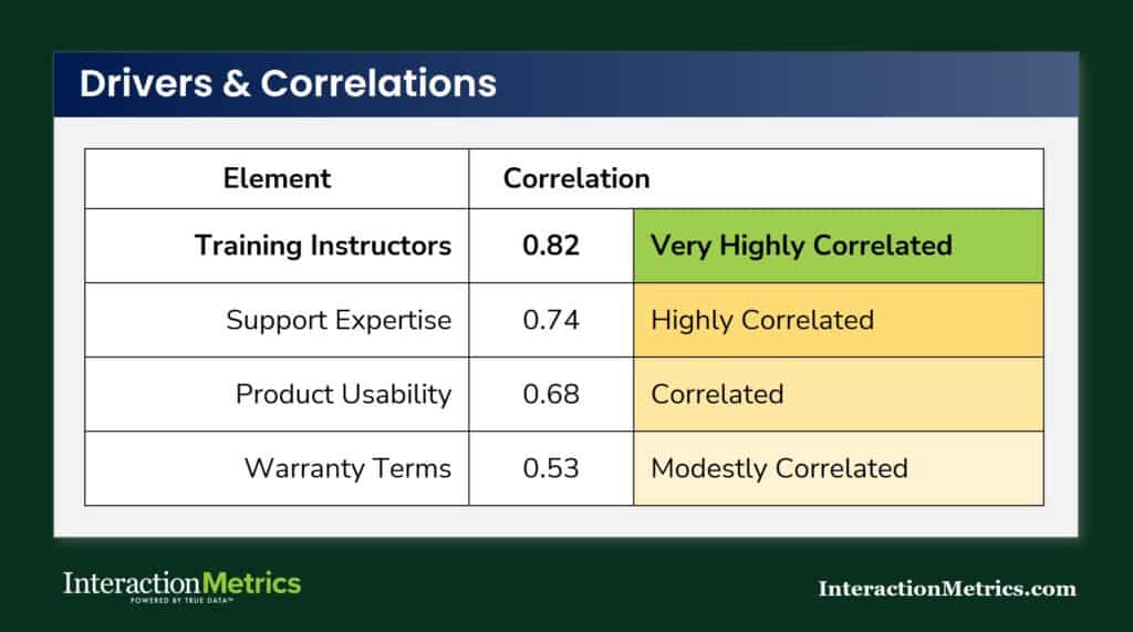
Correlation Analysis Identifies Key Drivers
Items with a high correlation to your outcome metric (NPS, overall satisfaction, or another top-line score) are your drivers.
High correlation means the two move together: when that item scores low, the outcome score tends to be low; when it scores high, the outcome score tends to be high.
TrueData™ Surveys are for B2B Companies
with High-Value Customer Relationships


A good customer survey isn’t one click. It’s dozens of steps.
We handle them all.
Let’s streamline your survey and give you data you can trust.
Built-In Features that Drive Growth

Software included.
No add-on costs. No upsells. No separate licenses. Just results.

Custom design. Bias-free.
Built from scratch to match your goals—no templates, no leading questions, no fluff.

Thematic insights.
Evidence based, statistically valid data presented in priority order.

Human-coded text analysis + AI.
Every open-ended response coded for nuance and clarity.

Highest response rates!
100% deliverability. 100% engaging. Surveys customers want to take.

CEO-ready Findings Reports.
Action-focused presentations designed for executives and frontline teams.
Trusted by Companies Like Yours


A Smarter Look at CX
Billions of surveys go out every day. NPS scores barely budge. Martha explains why in 90 seconds — and it comes down to science.
The Interaction Metrics Difference
- Scientific Survey Design: We build surveys that measure what matters — no leading questions, no bias baked in.
- Third-Party Objectivity: As an outside partner, we surface truths your internal team can’t see.
- Statistically Valid Facts: We use proven methodologies, so your data captures reality, not distortions.

The AI Survey Trap
AI builds surveys from templates, not experience. At Interaction Metrics, we use AI where it adds value and lose it where it doesn’t. Our analysts supply the oversight, alignment, and objectivity that AI can’t.
Built for B2B teams that need survey experts, not another DIY tool.
Only Need Software
Level 1
If you already have your survey designed, power it up with the best software and the experts who know how to use it.
$1500-$3000
Complete Design & Deploy
Level 2
All your survey questions, logic flow, rating scales, email campaign, and every other step are managed for you.
$6000-$9900
Get The Analysis Too
Level 3
Crosstabs, correlations, text analysis, dashboards, and findings decks with next-step actions presented to your team.
Varies by Complexity
Need Something More Tailored?
Not every challenge fits neatly into a package. We build custom research and survey strategies for teams with unique goals, complex audiences, or multi-phase initiatives.
Survey Data Analysis
| Aspect | Conventional Way | Science-First Approach | Our Science-First Outcomes |
|---|---|---|---|
| Open-Ended Feedback | Comments are skimmed or reduced to surface-level impressions. | Responses are read in context, coded with a defined framework, and analyzed for recurring themes. | You see not just what customers said, but what patterns are actually emerging. |
| Quantitative Results | Teams stop at topline scores, dashboards, or platform charts. | Ratings are broken out by segment, compared across groups, and examined over time. | You see where performance is strong or weak, and what areas to prioritize. |
| Crosstabs & Subgroups | Overall averages are treated as the whole story. | Results are analyzed by role, customer type, or other segments. | You find hidden problems in key groups. |
| Key Driver Analysis | Low scores and frequent complaints are assumed to be the top priorities. | Correlations and driver analysis are used to identify which factors actually move satisfaction. | You learn which issues are most consequential, not just most visible. |
| Statistical Interpretation | Small gaps are reported as meaningful without testing their validity. | Differences are tested for significance. | You can separate true signal from noise before acting on the findings. |
| From Findings to Action | Analysis ends with charts, summaries, or a dashboard export. | Quantitative results, coded verbatims, subgroup patterns, and driver findings are synthesized into a clear narrative. | You get decision-ready insight about what is happening, for whom, and why. |
About CX Analytics:
CX analytics help you go beyond scores and dig into what’s really happening with your customer experience.
It’s not just about collecting CSAT or NPS—it’s about knowing why customers are satisfied, what’s frustrating them, and where you’re winning or losing across different customer segments.
Our approach gives you clarity by breaking down the data by journey stage, customer type, and experience driver.
We combine expert analysis with AI tools to surface the issues that matter most and then work with you on how to solve them.
Whether you need to understand trends in customer feedback, track performance over time, or highlight gaps between expectations and reality, our CX Analytics make it possible. Everything we deliver is designed to help you make smarter, faster business decisions based on customer data you can trust.
How Do You Turn Survey Analysis Into Decisions, Not Just Reports?
Analysis that doesn’t connect to a decision is reporting. The analytical work — coding verbatims, running crosstabs, identifying drivers, testing significance — produces findings. Turning findings into decisions requires one more step: prioritization.
Not every common complaint is a strategic risk. Not every high-impact driver is something your organization can change. The move from analysis to action is about distinguishing the issues that matter most from the ones that are merely visible — and then connecting what the scores show, what the segments reveal, and what the verbatim comments explain into a coherent picture someone can act on.
In high-value B2B programs, the deliverable that supports that move is rarely a dashboard with filters. It’s a narrative with evidence — a summary of what was found, where it’s most concentrated, why it matters, and what specifically should happen next. That’s what a relationship manager can take into a conversation with a client. A chart can’t do the same job.
What Changes in Survey Analysis for B2B and High-Value Programs?
In high-volume consumer programs, individual responses average out. In B2B, one verbatim from a senior contact at a strategic account may be the most important data point in the dataset — and it won’t look that way in an aggregate summary.
Analysis in high-value programs needs to reflect account importance. That means surfacing responses from strategically significant accounts separately from the aggregate, not letting them disappear into an overall score weighted by response count rather than relationship value. It means reading at the individual level before aggregating. And it means recognizing that the accounts that matter most are often a small fraction of the total respondent pool — which makes how you weight and present their data a methodology decision with real business consequences.
Bottom Line
Survey analysis is where the investment in good design and careful sampling either produces something useful or gets wasted. Rigorous thematic coding, context-sensitive reading of open-ended responses, driver analysis that distinguishes signal from noise. None of that happens automatically, and none of it comes standard in a platform output.
Contact us to talk through what more rigorous survey analysis would look like for your program.
Let’s Build the Right Survey for You!
Stop settling for surveys that fall short. Let’s build a survey that gives you honest answers, drives action, and accelerates growth.
"*" indicates required fields