TrueData™ SURVEYS
How to Analyze Survey Data
A Guide to Open-Ended Responses, Crosstabs, and Key Drivers

Science-First ﹡ Human-Led ﹡ Software Included
We bring certified analysts, proven methods, and everything you need. No licensing costs, no learning curve.
Collecting survey data is the first step. What organizations do with it next is where things most often break down — and usually in one of two directions. Either the numbers get all the attention and verbatim comments get skimmed or skipped entirely, or someone reads through the comments, pulls out the ones that stand out, and calls it analysis. Neither produces findings you can build on.
In B2B and high-value programs, that “why” carries particular weight. A single verbatim from a senior contact at a strategic account can be more consequential than hundreds of averaged ratings — if you know how to read it in context. The goal of analysis isn’t a dashboard. It’s clarity about what’s happening, for whom, and what to do about it.
At Interaction Metrics, we code the verbatims, run the crosstabs, and deliver a Findings Report that shows exactly where the experience is breaking down and for whom. Book a TrueData™ Demo.
Whether you’re taking a science-first or conventional approach becomes most visible at the analysis stage.
Run your survey through Qualtrics or Alchemer and stop at the platform output, and you’re working with charts built from data that hasn’t been cleaned — duplicates still in, wrong respondents still counted, verbatims unread. The platform won’t distinguish between a distributor and an OEM, or tell you that three of those responses came from the same person on different devices.
A science-first approach cleans the data before analysis begins, reads responses at the individual level before aggregating to themes, and produces findings granular enough to show that your end-users have a specific frustration with field service that your OEMs don’t share — and that the gap between those two groups is statistically valid, not a sample artifact.
Survey Data Analysis: At-a-Glance
| Principle | Conventional Survey Approach | Versus Our Scientific Survey Approach | Science-First Outcomes |
|---|---|---|---|
| Open-Ended Feedback | Comments are skimmed or reduced to surface-level impressions. | Responses are read in context, coded with a defined framework, and analyzed for recurring themes. | You see not just what customers said, but what patterns are actually emerging. |
| Quantitative Results | Teams stop at topline scores, dashboards, or platform charts. | Ratings are broken out by segment, compared across groups, and examined over time. | You see where performance is strong or weak, and what areas to prioritize. |
| Crosstabs & Subgroups | Overall averages are treated as the whole story. | Results are analyzed by role, customer type, or other segments. | You find hidden problems in key groups. |
| Key Driver Analysis | Low scores and frequent complaints are assumed to be the top priorities. | Correlations and driver analysis are used to identify which factors actually move satisfaction. | You learn which issues are most consequential, not just most visible. |
| Statistical Interpretation | Small gaps are reported as meaningful without testing their validity. | Differences are tested for significance. | You can separate true signal from noise before acting on the findings. |
| From Findings to Action | Analysis ends with charts, summaries, or a dashboard export. | Quantitative results, coded verbatims, subgroup patterns, and driver findings are synthesized into a clear narrative. | You get decision-ready insight about what is happening, for whom, and why. |
What Did Customers Rate, and Why Did They Rate It That Way?
Quantitative survey analysis answers the first question. It tells you what customers rated — satisfaction, ease, likelihood to recommend, quality of specific interactions — and how those ratings compare across segments, over time, and against whatever benchmarks you’re tracking. This is the “what”: a score of 62 out of 100, a 14-point gap between your distributor segment and your direct accounts, a statistically significant drop in technical support ratings since last quarter.
Qualitative analysis answers the second question. It tells you why a score is a 62 and not an 80, why distributors are rating differently than direct accounts, what specifically about technical support has changed. The numbers establish that something is happening. The open-ended responses explain it.
The third question — how do you get from 62 to 80? — is where analysis connects to action. It requires both tracks working together: quantitative data to identify where the gaps are and how large they are, qualitative data to explain what’s driving them, and driver analysis to separate the issues that actually move the outcome from the ones that are common but not consequential. That’s what turns analysis into a plan rather than a report.
Quantitative vs. Qualitative Survey Analysis
Quantitative analysis works with the numbers: ratings, scores, how segments compare, what’s changed over time.
Qualitative analysis works with the language: what customers wrote, what themes emerge, and why the scores landed where they did.
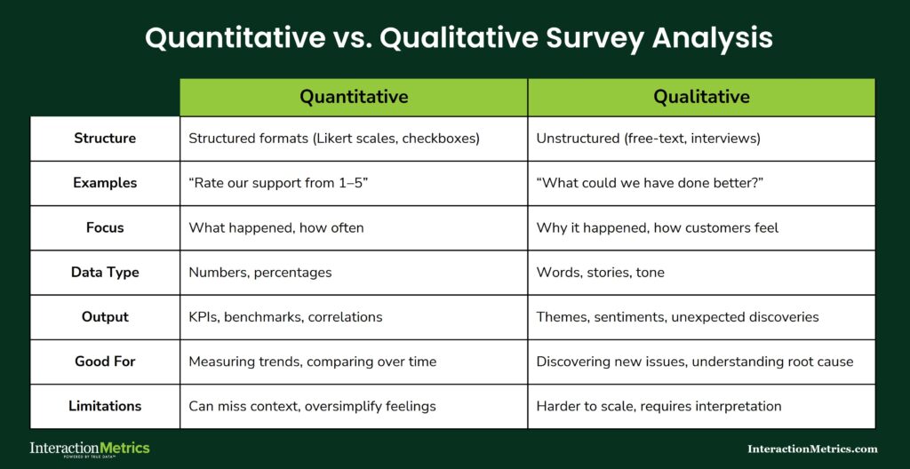
One tells you what happened. The other tells you why. A survey program that runs only one track produces conclusions that are either shallow or anecdotal — you need both to get the full picture.
What Is Thematic Text Tagging?
Thematic text tagging is the process of reviewing open-ended responses and applying descriptive labels (tags) to identify recurring patterns across respondents. It’s distinct from keyword counting in a fundamental way: the prevalence of a word is not the same as the prevalence of an idea. A respondent who writes “the process was a nightmare” and one who writes “getting approvals took forever” are both describing the same issue. A keyword search finds neither. Thematic coding finds both.
Surface themes capture what was mentioned. Interpretive themes capture what it means — for the relationship, for the account, for the business decision that follows. Both levels of analysis matter, but they require different work and produce different outputs.
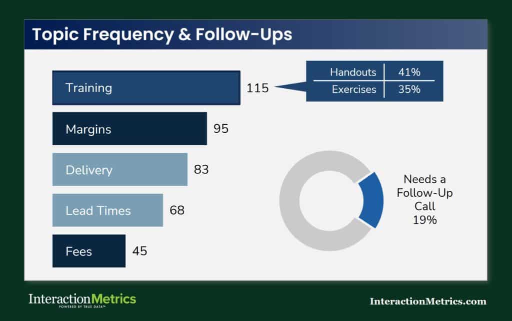
From Comments to Priorities
Thematic tagging gives you a ranked view of what customers are actually talking about and what matters most to them.
In this example, training surfaces as the most frequently mentioned topic, with specific subtopics (handouts, exercises) coded within it.
The donut chart flags the share of respondents whose comments indicate a need for a follow-up call — a finding that only emerges when responses are read and coded rather than counted.
Building a Coding Framework Before You Start Tagging
Three things need to be settled before a single response gets coded, and all three are regularly skipped in practice.
First, how themes are defined. Each code needs a specific definition — what it includes, what it excludes, and what distinguishes it from codes that might overlap. Vague category names like “communication issues” produce inconsistent tagging because two analysts will apply them differently.
Second, how codes are applied consistently. A codebook documents the definitions, includes example responses for each code, and specifies how edge cases get resolved. It should exist before coding begins — not get built retroactively to explain choices that were already made.
Third, how to reduce subjective interpretation. Analysts calibrate by reviewing and discussing the same set of responses before coding independently, then reconciling disagreements against the codebook. That process catches interpretation drift before it compounds across hundreds of responses.
Open-ended responses are also written informally, which means assigning them to a category accurately requires working through them in a structured sequence. At Interaction Metrics, that process follows five steps.

- Substantive: Is the comment specific enough to be tagged objectively, or is it too vague to classify reliably?
- Department: Which part of the organization is the customer referring to — repairs, customer support, technical training, field service, account management?
- Sentiment: What is the emotional register of the comment — satisfied, frustrated, neutral, ambivalent?
- Topic: What is the comment specifically about? This is the most analytically important step, but it’s only reliable after the first three.
- Sub-topic: What product, service, or process does the comment address within that topic?
Taxonomy construction can run top-down — starting from known CX dimensions and applying them to the data — or bottom-up, letting categories emerge from what respondents actually said. In practice, a hybrid works best: a top-level framework built around the dimensions you know matter, with subcodes that reflect the specific language and concerns that surface in the data.
What Can Sentiment Analysis Tell You — and What Can’t It?
Sentiment analysis identifies emotional tone. It does not identify the issue, the cause, or what should happen next. That distinction matters more than most sentiment analysis outputs acknowledge.
Responses regularly contain mixed signals. A comment might open with genuine appreciation and close with a specific complaint. A frustrated customer in a long-term B2B relationship might frame an operational failure diplomatically because they value the relationship and don’t want to escalate. Tone-only analysis reads the diplomatic framing and misses the failure entirely.
In B2B programs especially, polite language is common regardless of underlying satisfaction. A “positive” sentiment score in a high-touch account relationship can reflect relationship management rather than genuine experience quality. Sentiment tells you the emotional surface of a response. What the response actually says requires reading it.
Should Survey Text Analysis Be Done by AI, Humans, or Both?
AI text analysis tools process volume quickly. That speed is real, and for very large datasets it can be useful as a first pass. The tradeoffs are also real, and they become more consequential as the decisions that follow from the analysis get more significant.
What AI handles reasonably well: flagging high-frequency terms, rough sentiment sorting, initial clustering of responses into broad categories for human review.
Where AI analysis breaks down in CX contexts: it overweights repeated language rather than repeated ideas. It can’t evaluate a response in the context of the question that preceded it — which means it regularly misreads responses that only make sense in context. It reads polite deflection as satisfaction. It misses sarcasm, qualified praise, and the kind of relationship nuance that characterizes B2B feedback.
There’s also a specific problem with customer repetition that AI tools handle poorly. When a respondent mentions the same issue across multiple open-ended questions (which happens often) AI tools tend to count each mention as a separate signal, inflating the apparent importance of that topic in the aggregate findings.

A customer who references a side-button defect in three different answers to three different questions isn’t three customers with a concern about the side button. They’re one customer reinforcing a single point. Human analysts recognize this pattern intuitively. AI tools, analyzing each answer independently, typically don’t — and the result is an over-indexing of certain themes that skews the findings.
Why Context Changes Everything in Text Analysis
Reading a survey response without knowing the question it was answering is like reading an answer without knowing the question. The response “it’s fine” means something very different after “how would you rate the technical support team?” than after “would you recommend us to a colleague?” Analyzing responses at the individual level — question and answer together, before aggregating to themes — is what produces findings that reflect what customers actually meant rather than what they happened to type.
When AI-Assisted Analysis Is Worth Using
AI works as a first pass on datasets large enough that human reading of every response isn’t feasible. It can surface candidate themes for human review, flag high-frequency terms worth investigating, and handle initial sorting into broad categories. What it can’t do is replace the human judgment that catches context, recognizes repetition, and distinguishes between a widespread concern and one customer making the same point three times.
The bigger point: regardless of how AI is used in the analysis process, a human analyst needs to verify the output. AI gets sentiment wrong, misreads intensity, and produces confident-looking results that don’t hold up under scrutiny. Treating AI output as final — without human review — is where analysis errors compound into decisions made on findings that weren’t accurate to begin with.
What Is Expectation-Gap Analysis and Why Does It Matter?
Satisfaction scores tell you how customers rated their experience. Expectation-gap analysis tells you where that experience fell short of what customers expected — and by how much. Those are related but different questions, and the gap between them is often where the most actionable findings live.
A customer who rates an experience 4 out of 5 may still feel it underdelivered relative to what they were told to expect or what past experience led them to anticipate. A score that looks acceptable can mask a meaningful gap between expectation and reality — one that’s corroding trust in ways the satisfaction number doesn’t capture.
The method is to compare expected experience against perceived experience at the touchpoint or relationship level, item by item. The largest deltas identify where attention is most needed, independent of the overall score.
How Do You Find the Biggest Deltas?
Compare expectation and experience ratings at the item level, not just in aggregate. A solid overall score can conceal a significant gap in one dimension that a specific segment or account tier cares about most.
Examine gaps by segment — what’s within an acceptable range for one customer type may represent a real problem for another. Apply the same logic to open-ended responses: comments that express surprise, disappointment, or unmet expectations are a distinct analytical category and should be flagged and reviewed separately rather than folded into general dissatisfaction. And prioritize by consequence, not just by size — a large gap in a low-stakes area matters less than a smaller gap in something that directly affects renewal decisions.
Crosstabs and Subgroup Analysis
Crosstabs break overall results into segments to surface patterns that aggregate scores conceal.
An overall satisfaction rating that looks stable can be hiding a serious problem in one account tier, one region, or one customer type — and without crosstabs, you’d never know it was there.
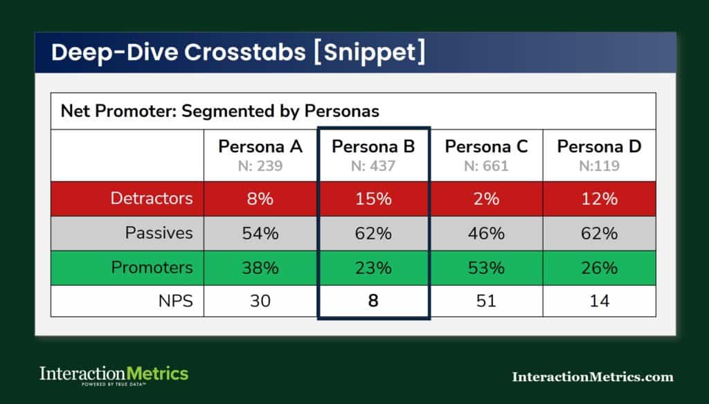
Standard CX crosstabs run by account tier, customer type, region, tenure, product line, or role. The discipline required is in interpreting them honestly: segment differences need to be both practically meaningful and statistically supportable before they drive decisions. Running enough crosstabs will always surface apparent patterns. The ones most worth scrutinizing are the ones that confirm what you already believed.
Why Does Subgroup Analysis Matter More in High-Value Programs?
In high-value programs, subgroup analysis regularly tells a more consequential story than the overall score. A major account with satisfaction ratings that look acceptable in aggregate — because it’s averaged with many smaller, happier accounts — is a business risk that the total score is actively obscuring.
Role-based subgroup analysis is particularly important in B2B programs. Procurement contacts, operations managers, and executive sponsors at the same account often have substantially different views of how the relationship is going. Combining them into a single account-level average produces a number that doesn’t accurately reflect any of their actual experiences.
What Is Key Driver Analysis and How Is It Different from Ranking Low Scores?
Key driver analysis identifies which survey items most strongly predict an outcome — usually overall satisfaction, loyalty, or likelihood to recommend. It answers a different question than “what scored lowest.” A frequently mentioned complaint is not automatically the issue that most affects retention. Some problems are common but tolerable. Others are infrequent but directly tied to whether customers stay.
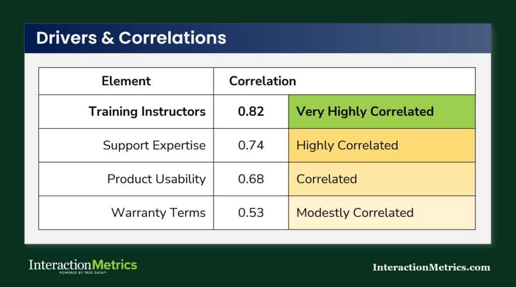
Correlation Analysis Identifies Key Drivers
Items with a high correlation to your outcome metric (NPS, overall satisfaction, or another top-line score) are your drivers.
High correlation means the two move together: when that item scores low, the outcome score tends to be low; when it scores high, the outcome score tends to be high.
Correlation doesn’t tell you the item scored well — it tells you that item is linked to the outcome, in either direction. A low-scoring item with a high correlation to NPS is a high-priority problem. A low-scoring item with a weak correlation may be worth noting but isn’t what’s driving your overall results.
Driver analysis also flags a practical constraint: some factors correlate strongly with satisfaction without being within your organization’s control. Competitive pricing, contract terms, and broader market conditions affect scores but aren’t things you can change. Knowing which drivers are high-impact and controllable is what makes the analysis actionable rather than interesting.
Presenting driver findings well means ranking by impact, flagging by controllability, and anchoring the statistical output with verbatim evidence. A coefficient by itself is abstract. A coefficient plus a pattern of comments from specific account types is a finding someone can actually do something with.
How Does Driver Analysis Work by Metric?
NPS drivers, CSAT drivers, and CES drivers are often different from each other. What predicts whether a customer would recommend you isn’t always the same as what predicts their satisfaction with a specific interaction, or how easy they found it to get something done. Running driver analysis by metric surfaces those differences — and the tradeoffs they imply. Where should improvement efforts focus to produce the most movement in the metric your leadership cares most about? That’s the question driver analysis is built to answer.
What Does Statistical Significance Mean in Survey Analysis?
Statistical significance answers one question: is this difference likely to reflect a real pattern, or is it within the range of normal variation? It’s a check on whether what you’re seeing in the data is worth acting on, or whether it could have appeared by chance even if nothing actually changed.
It matters when you’re comparing segments, tracking change over time, or evaluating whether a score shift is real. A 3-point improvement that doesn’t clear the significance threshold isn’t a 3-point improvement — it’s noise dressed as progress. Reporting it as meaningful is how programs spend resources on problems that may not exist and miss credit for improvements that did happen.
What significance doesn’t tell you is whether a finding matters to the business. A difference can be statistically significant and practically irrelevant. Effect size and business context both factor into whether a finding is worth acting on — and neither is captured in a p-value. When sample sizes are too small to test for significance reliably, the right move is to say so clearly rather than report findings at a precision the data can’t support.
How Should You Benchmark Survey Results?
Internal benchmarks — your own results compared across waves — are almost always more useful than external industry comparisons. When the methodology is consistent, movement in your own scores tells you something reliable about whether the experience is improving. External benchmarks introduce too many variables: different question wording, different scales, different populations, different administration modes. Two programs using the same metric can produce incomparable results if the underlying methodology differs.
That said, external benchmarks provide context worth having — as long as you’re scrutinizing what you’re actually comparing. Same or equivalent questions, similar audience, consistent scale, comparable survey context: all four need to hold for the comparison to be meaningful. One or two out of four produces a number that looks like a benchmark and isn’t.
Benchmarking open-ended themes over time is an underused method. Tracking which code categories grow or shrink across survey waves shows you whether a concern is becoming more or less prevalent — which is often more actionable than knowing the current score.
How Do You Turn Survey Analysis Into Decisions, Not Just Reports?
Analysis that doesn’t connect to a decision is reporting. The analytical work — coding verbatims, running crosstabs, identifying drivers, testing significance — produces findings. Turning findings into decisions requires one more step: prioritization.
Not every common complaint is a strategic risk. Not every high-impact driver is something your organization can change. The move from analysis to action is about distinguishing the issues that matter most from the ones that are merely visible — and then connecting what the scores show, what the segments reveal, and what the verbatim comments explain into a coherent picture someone can act on.
In high-value B2B programs, the deliverable that supports that move is rarely a dashboard with filters. It’s a narrative with evidence — a summary of what was found, where it’s most concentrated, why it matters, and what specifically should happen next. That’s what a relationship manager can take into a conversation with a client. A chart can’t do the same job.
What Changes in Survey Analysis for B2B and High-Value Programs?
In high-volume consumer programs, individual responses average out. In B2B, one verbatim from a senior contact at a strategic account may be the most important data point in the dataset — and it won’t look that way in an aggregate summary.
Analysis in high-value programs needs to reflect account importance. That means surfacing responses from strategically significant accounts separately from the aggregate, not letting them disappear into an overall score weighted by response count rather than relationship value. It means reading at the individual level before aggregating. And it means recognizing that the accounts that matter most are often a small fraction of the total respondent pool — which makes how you weight and present their data a methodology decision with real business consequences.
Bottom Line
Survey analysis is where the investment in good design and careful sampling either produces something useful or gets wasted. Rigorous thematic coding, context-sensitive reading of open-ended responses, driver analysis that distinguishes signal from noise — none of that happens automatically, and none of it comes standard in a platform output.
Contact us to talk through what more rigorous survey analysis would look like for your program.
Trusted by Companies Like Yours


Let’s Build the Right Survey for You!
Stop settling for surveys that fall short. Let’s build a survey that gives you honest answers, drives action, and accelerates growth.


"*" indicates required fields